Based on existing research on modern travel behavior:
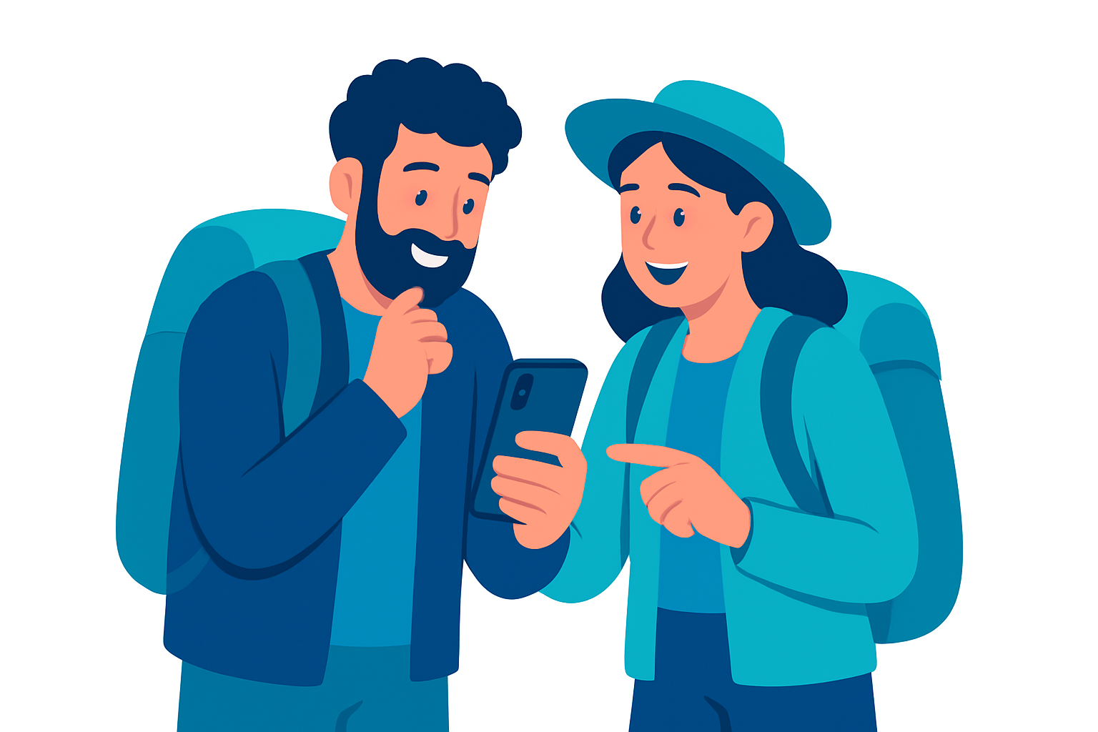
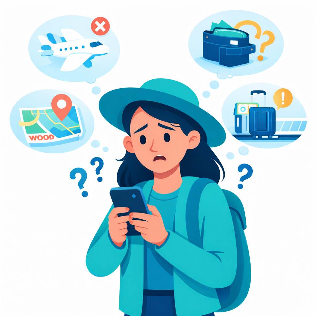
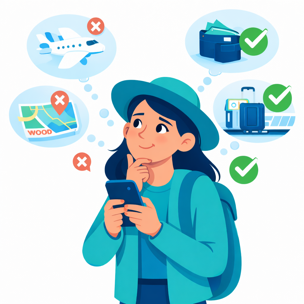
Travel planning today is extremely fragmented.
Through early research, I saw the same pattern across every traveller type — from 26-year-old freelancers to 67-year-old retirees:
Plans live across WhatsApp, Google Docs, Airbnb, Spreadsheets, and Instagram saves.
Finding travel partners is either awkward, unsafe, or simply unavailable as a feature.
Group coordination breaks down because no one takes the lead.
Planning tools focus on logistics, not connection.
During early research, I realized something interesting:
Even though the travel tech market is huge, there are still no platforms designed for:
Solo travelers who want company
Small groups who want to expand their group
Older adults or retirees who want community
Working professionals who want synced schedules
Anyone who wants shared energy, not random matches
Travel is social by nature — but travel planning is still fragmented, lonely, and scattered across apps.
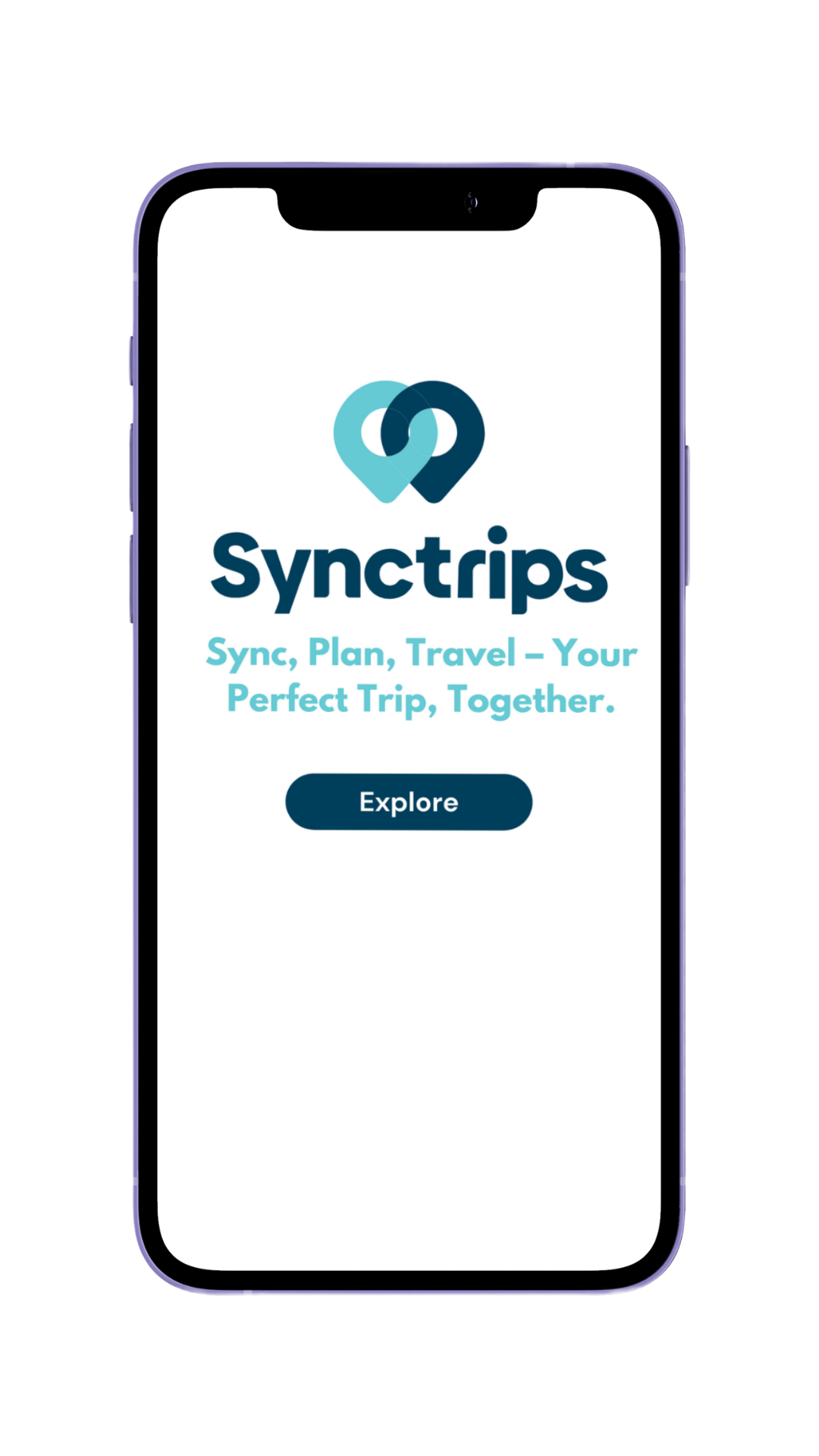
Synctrip aims to fix that.
The gap:
No current tool lets travellers plan together and find aligned travellers in one place.
Everything is either a travel app or a social app but never both. Synctrip fills this by blending the clarity of planning tools with the social familiarity of swipe mechanics.
How do travelers use their time?
My Hypothesis
At the beginning, I believed Synctrip wouldmostly serve young solo travelers .
But early interviews challenged this idea almost immediately. It became clear that the real problem wasn’t age or experience; it was the lack of a simple, shared space where people could find compatible co-travelers and plan trips without chaos.
Research
Research Sources:
Reddit travel communities
Instagram travel pages
Chats with friends & travellers during trips
Conversations with small travel groups
Notes from casual interviews (5 personas captured)
Sample:
A wide age range — 20s, 30s, 40s, 50s, 60s
Solo travellers, small groups, retirees, creative professionals
Research Questions:
These questions guided every interview and shaped SyncTrip’s structure and tone:
How do you currently plan your trips?
Where do your ideas and inspiration come from?
What frustrates you the most during planning?
How do you organise your saved content (reels, photos, links, notes)?
What causes confusion or stress while planning?
What makes you feel calm or “held” during the process?
How do group plans break down, and when do they succeed?
What makes you trust a recommendation—or ignore it?
What would make you open a travel app every day, not just before a trip?
Artifacts:
5 Personas (Aarav, Ananya, Ravi, Meera, Lucas)
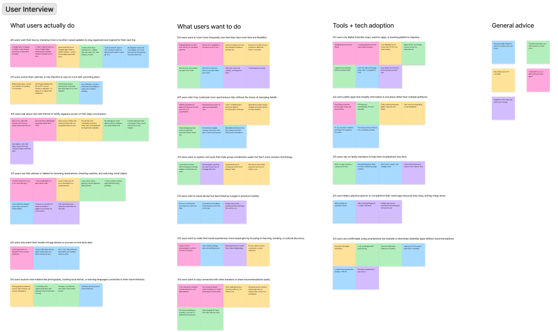
Affinity mapping
Screenshots of real planning threads
Notes from actual travel group behaviour
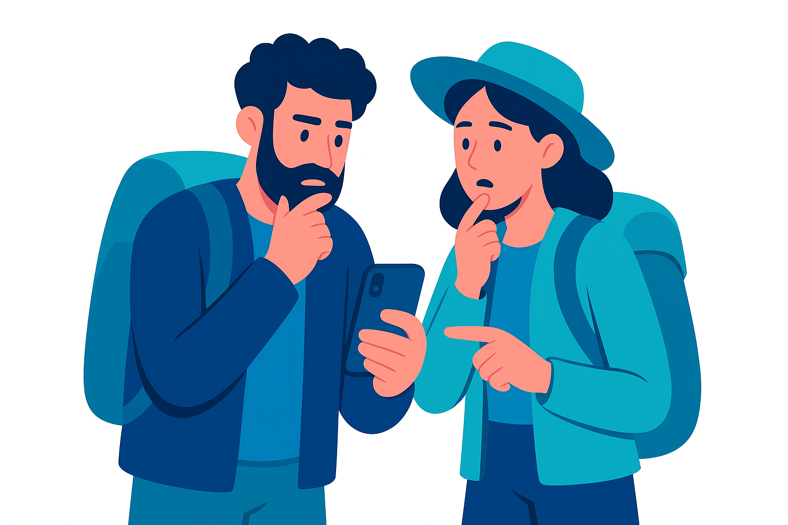
Getting to know solo travelers through user interviews
I spoke with travellers across different age groups and life stages—solo travellers, small friend groups, retirees, and working professionals. Most of them travelled often but still struggled with connection, planning clarity, or coordinating with others.
What I wanted to understand
How people of different ages actually make travel decisions
Why planning feels overwhelming or confusing
Whether travellers genuinely want to meet new people—or only when it feels safe and aligned
How group plans fall apart (and why they work when they do)
If “social discovery through travel” is something they find meaningful or risky
These conversations helped me shape clear, grounded personas—Aarav, Ananya, Ravi, Meera, and Lucas—and understand the emotional patterns behind how people plan trips, not just the functional ones.
4/5 users begin their travel planning by casually browsing content on Instagram, Pinterest, or Google just to “feel inspired” and mentally shortlist places without making any real bookings yet.
3/5 users maintain travel checklists or personal notes in scattered places like WhatsApp saved messages, phone notes, or physical diaries before committing to a plan.
4/5 users rely on friends or family availability before confirming a trip, which often leads to plans getting delayed or dropped due to misaligned schedules.
3/5 users end up storing travel ideas for “later” but never revisit them due to lack of structured reminders or collaborative planning tools.
What do travellers WANT?
5/5 users want to travel more frequently rather than waiting for an annual big trip.
4/5 users want to connect with people who share similar travel styles, budget ranges, and energy levels to avoid mismatched expectations during trips.
3/5 users specifically expressed a desire for a system that helps with early-stage group coordination before bookings are made.
4/5 users want to avoid being the only one responsible for organizing everything in a group, which often causes burnout and eventually ruins excitement for the trip.
Is there a disconnect between what travellers want and what they actually do?
According to user interviews, motivation to travel is already high. The real problem is coordination fatigue, scattered communication, and not finding the right people to go with.
The gap between behaviour and desire
The motivation to travel is already high.
The real blockers are:
Coordination fatigue
Scattered communication
Lack of compatible co-travellers
Unclear group decision structure
I realized my hypothesis was wrong.
Synctrip isn’t only for young solo travellers.
Older adults, retired travellers, and family-based planners also expressed a strong need for structured planning and aligned companionship.
The challenge isn’t age! it’s the absence of a platform that supports shared decision-making before a trip truly begins.
My hypothesis was wrong!
I initially believed that Synctrip would primarily serve young travelers
Through interviews, I met:
Teachers who travel in small groups
Retirees who want company
Solo travellers who don’t want to feel lonely
Small teams wanting smoother coordination
Synctrip is not age-based.
Synctrip is rhythm-based.
It’s for anyone seeking aligned travel energy — not just young travellers.
This reframed the entire product direction.
DEFINE
Defining the actual problem
Travellers are willing and excited to explore, and they do have time or flexibility, but findingcompatible co-travellers and keeping coordination alive is the real barrierstopping plans from turning into trips.
"I hate when 5 people say yes to a trip but no one wants to take the lead. The plan just dies in the chat."
– 31 year old user
"I want to go on trips but my friends never match my excitement, budget or pace. I wish I could just find people who are already planning."
– 62 year old retired traveler
Rerouting the research
New research focus: Social coordination layer in travel planning
Now that the problem space was properly framed, the direction of research shifted with these core questions guiding the next phase:
How do people currently try to coordinate group trips and where does it fail?
What trust or compatibility signals do users need before agreeing to travel with someone?
How can a platform keep excitement and momentum alive between the “idea phase” and actual bookings?
What communication and planning patterns lead to trips actually happening versus being abandoned?
New Research Direction
Key questions now shifted to:
How do groups actually coordinate?
What causes momentum loss between “let’s go” and “actually booking”?
How do different age groups perceive trust?
What signals make travel buddy discovery feel safe?
How can planning feel like a conversation instead of a task?
Research for the content
Before designing features, I needed to understand how people actually plan trips, not the polished version, but the messy real version that happens in group chats at 1:30 AM.
So I studied trip planning behaviour through travel forums, group chat screenshots from participants, and user interviews. A repeating pattern surfaced:
Most group trips start with excitement but quickly turn into scattered decisions floating inside different chats, notes apps, and Google searches.
People don’t lack places to go, they lack a shared workspace where everyone can contribute without chaos.
Travel blogs and itinerary websites exist, but they are single-user oriented. Group travel still depends on one person copying links, collecting confirmations, and chasing people for decisions.
This helped me shape Synctrip not as just another itinerary tool, but as a shared decision space where everyone in the group can interact with the plan instead of just reacting to it.
Research for the method – Competitive review
To position Synctrip properly, I reviewed three types of existing solutions:
Google Docs / Notion trip templates
Works for organization but feels too formal. People drop off because it feels like “work”, not trip planning.
WhatsApp group coordination
Fast and familiar, but information sinks the moment it’s sent. Nothing stays structured. People keep asking “Final plan kya hai?” even after days of chatting.
Travel apps like TripIt, MakeMyTrip, Klook
Good for bookings, but they treat planning as a personal checklist, not a shared group journey. No emotional collaboration layer.
Across all tools, the missing element is participation. There is no space where people can vote, react, pin ideas, lock dates, or track who's in and who's out.
Deep Dive Research
I analysed:
Real WhatsApp group threads
Moment-by-moment behaviour of group planning
How people save, share, shortlist, and postpone decisions
Why older users drop off when screens have too much text
Why Gen Z prefers swipe mechanics over scroll lists
Core Patterns
People like visuals → they hate long cards
One-focus-per-screen works better for all age groups
When the process feels “heavy”, they abandon
People need micro-confirmations (“who’s coming?”, “dates?”, “budget?”)
Tools Checked
Google Docs
Nortion
Airbnb
Tripato
Trip Adviser
Travel Buddy App
Tinder
Strengths Observed
Airbnb visual clarity
Tinder’s effortless swipe
Notion’s structured organisation
WhatsApp’s familiarity
Weaknesses Noticed
No shared decision-making
No group-to-group matching
No built-in date coordination
No travel buddy discovery integrated with planning
Itineraries overloaded with text
Opportunity
No app supports shared, interactive, multi-person planning + matching in one system.
My hypothesis was wrong!
HMW (How Might We...)
How might we reduce decision fatigue during planning?
How might we make choosing destinations intuitive?
How might we make travel buddy discovery feel familiar but safe?
How might we support both solo + group travellers in the same flow?
How might we keep older users comfortable while keeping the interaction modern?
Brainstorming solution ideas
Using this HMW question as a filter, I started brainstorming different ways Synctrip could intervene in the current planning mess. I wrote down every possible interaction that could reduce friction between group members — from quick polls to synced calendars to playful “Are you actually coming?” confirmation nudges.
But adding everything was not the goal. The goal was to reduce mental load, not add another complex tool that needs a tutorial to understand. So I used the research insights to define clear product goals that helped me eliminate anything that didn’t actively make group alignment smoother.
Product Goals
Make it easy for everyone in the group to see the plan taking shape in one place
Replace endless “final dates???” messages with a shared confirmation flow
Give non-planner members quick ways to participate without feeling responsible
Reduce friction by letting people vote, react, and lock preferences in one tap
Support the planner friend by shifting the planning from one-person task to visible group progress
Brainstorming
Ideas explored:
Swipe-based destination shortlisting
Group date-voting
Itinerary builder broken by days with visible dates
Travel mood tags
A “Who’s Coming?” step after each plan
Group-to-group matching
Visual-first dashboard
Prioritizing with an MVP mindset
So I asked a very direct question:
What is the smallest version of Synctrip that still solves the chaos of group planning? This helped eliminate heavy features like shared packing lists or experience journals from early versions.
Took alot of messy conversations
But we were able to finalise a path
Included
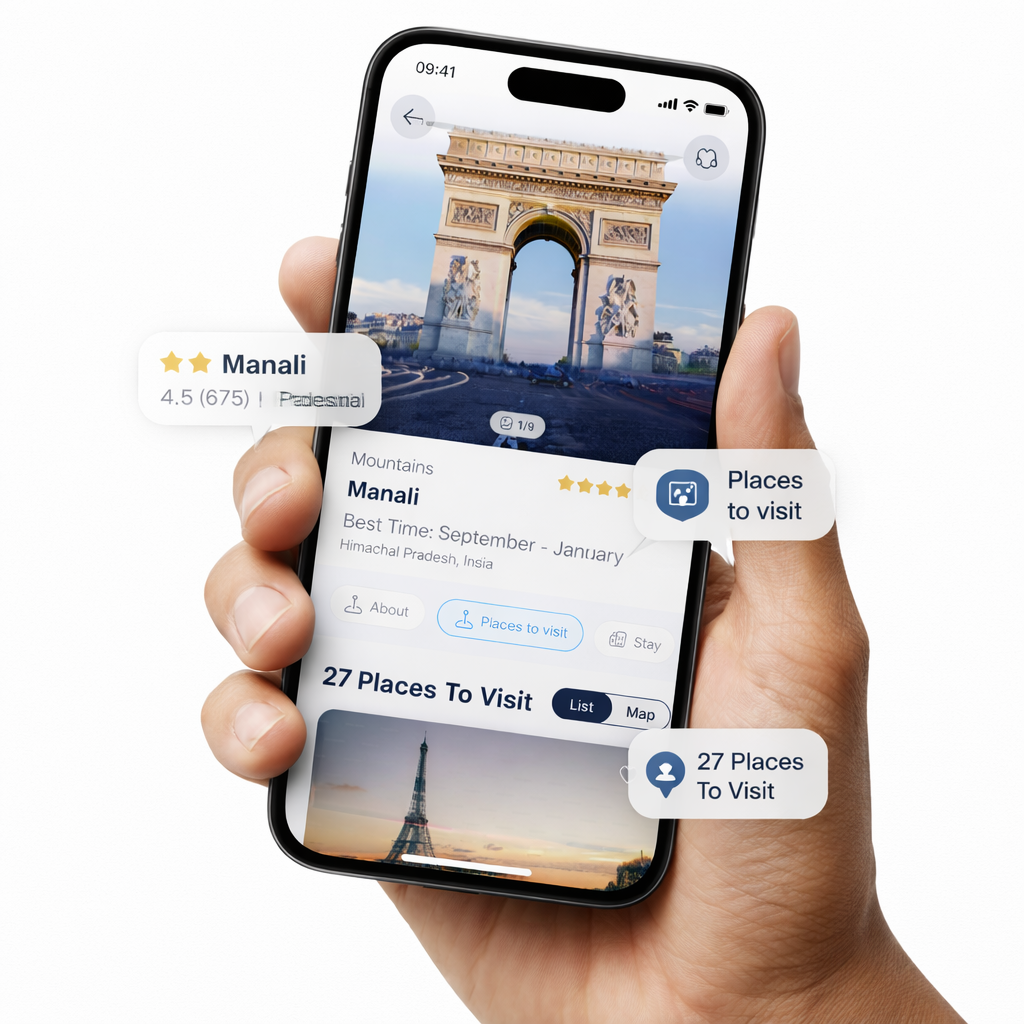
Itinerary builder (day-wise + date-based)
Dual calendar system
Destination swipe shortlisting
Trip dashboard
Travel buddy discovery
Group and solo matching
Safe verified profiles
Basic chat
Mood tags
Save lists
Removed / Delayed
Advanced budgeting
Automated bookings
Multi-currency tools
Social feed with reels/photos
AI itinerary generation (planned for V2)
Reason:These features add complexity without helping early flow validation.
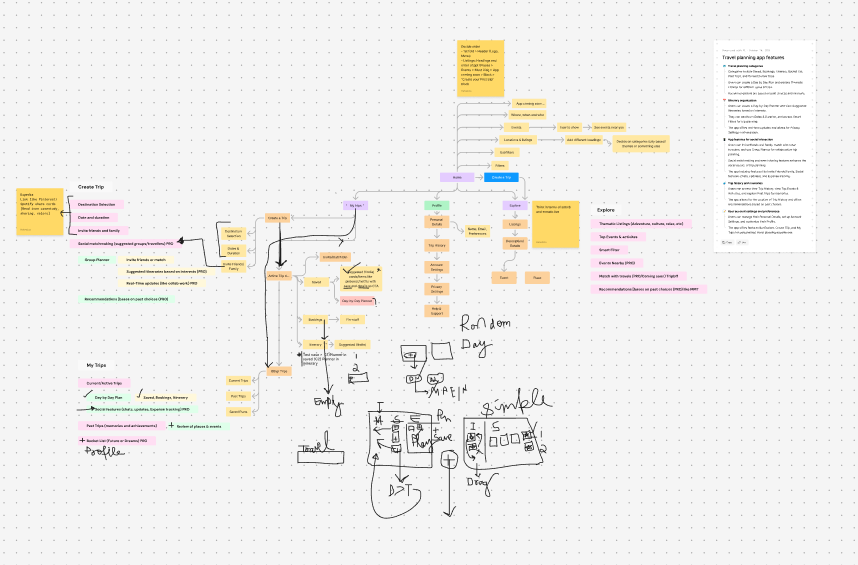
Where and how will users achieve these product goals?
To answer that, I started mapping an early sitemap structure, referencing how users currently navigate through trip planning using WhatsApp chats, Google Docs and mental notes. Instead of copying competitor flows, I used conversation-like hierarchy — the way trips actually start:
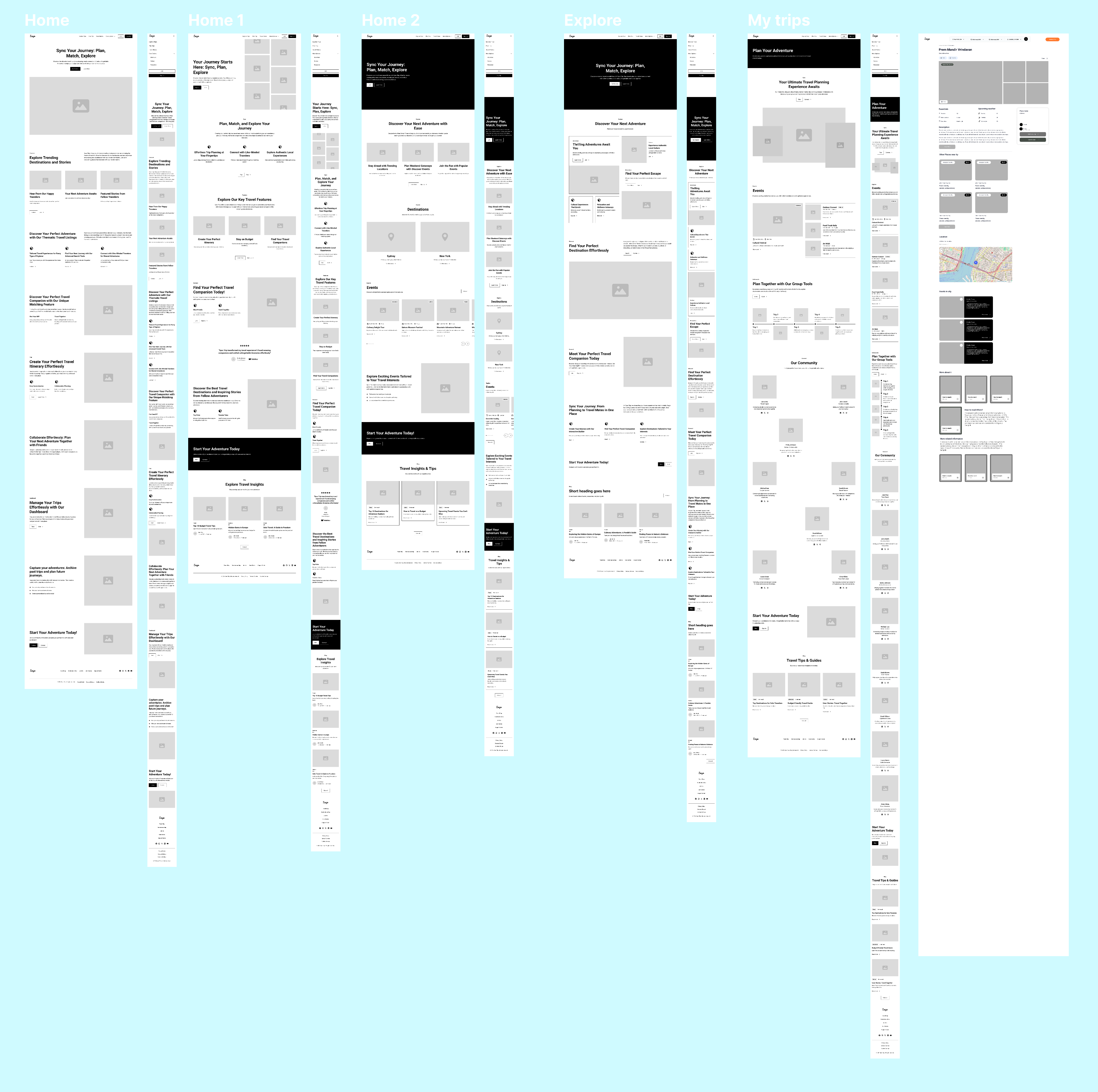
Home → Start Plan → Destination Swipe → Date Selection → Itinerary Builder → Invite → Trip Dashboard → Sync + Travel
Before detailing every branch of the app, I focused only on the essential touchpoints that would need to exist to test if Synctrip actually reduces planning fatigue.
The IA respects natural behaviour:
visual → choose → sync → refine.
Everything stays linear, soft, and low-stress.
Respecting existing user behaviour
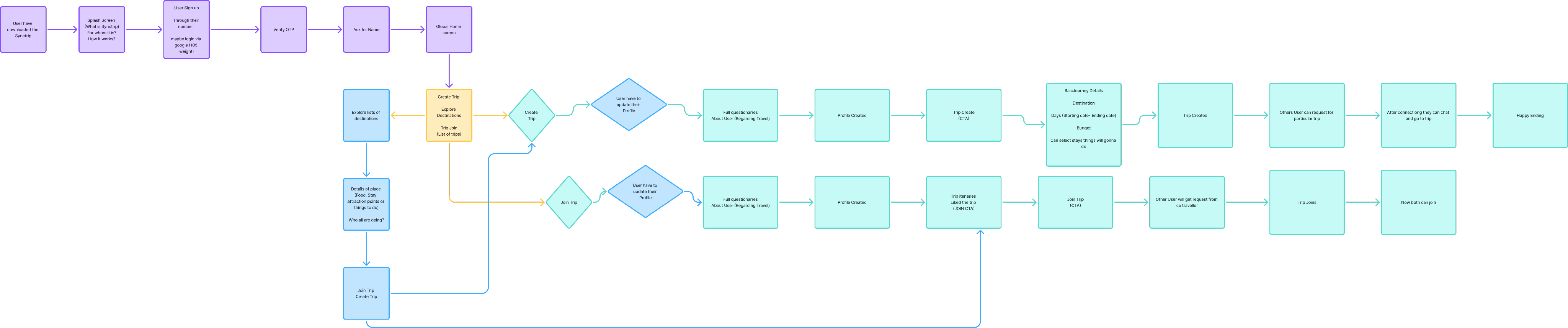
From research, 4/5 users already start trip planning in WhatsApp to “float the idea first.” Instead of forcing them to abandon their natural behaviour, I introduced a “Convert Chat to Plan” entry point — a way to turn an existing idea or chat link into a Synctrip board instantly.
This became the first user flow I developed — because onboarding should feel like a continuation of their existing habit, not a fresh start.
Example flow: User drops a trip idea in chat → Taps “Sync this plan” → Synctrip generates a shared planning board with built-in voting
Primary flows for usability testing
To test whether Synctrip actually reduces back-and-forth frustration, I prioritized these core flows for usability testing:
Start a trip plan and invite people without leaving the group chat
Set up a date voting session and watch how the group interacts
See how users respond to the “Who’s actually coming?” toggle
Check if the trip dashboard actually reduces repeated questions like “Final plan? Budget? Dates?”
These flows directly map back to the product goals and allow me to see if the app is doing what it promised — making planning feel shared, not scattered.
Finding design patterns for every element
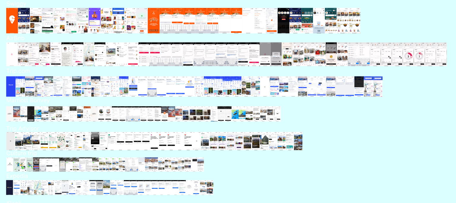
Inspiration to Prototype
For the first round of Synctrip sketches, I placed quick wireframes alongside interface patterns from well-known travel and lifestyle platforms to study interactions that already feel intuitive to users.
I drew inspiration from Swiggy’s straightforward decision-making flows, Airbnb’s clear and confidence-building layouts, Trip.com’s structured search and booking patterns, and the way Marriott Bonvoy simplifies complex travel information without overwhelming the user. These references helped guide early choices around navigation, hierarchy, and interaction so the experience felt familiar from the very first use.
This inspiration phase made the shift from low-fidelity to mid-fidelity designs far more seamless. Because the foundation was built on proven user behaviors rather than experimental patterns, the overall structure remained strong and consistent as the design evolved.
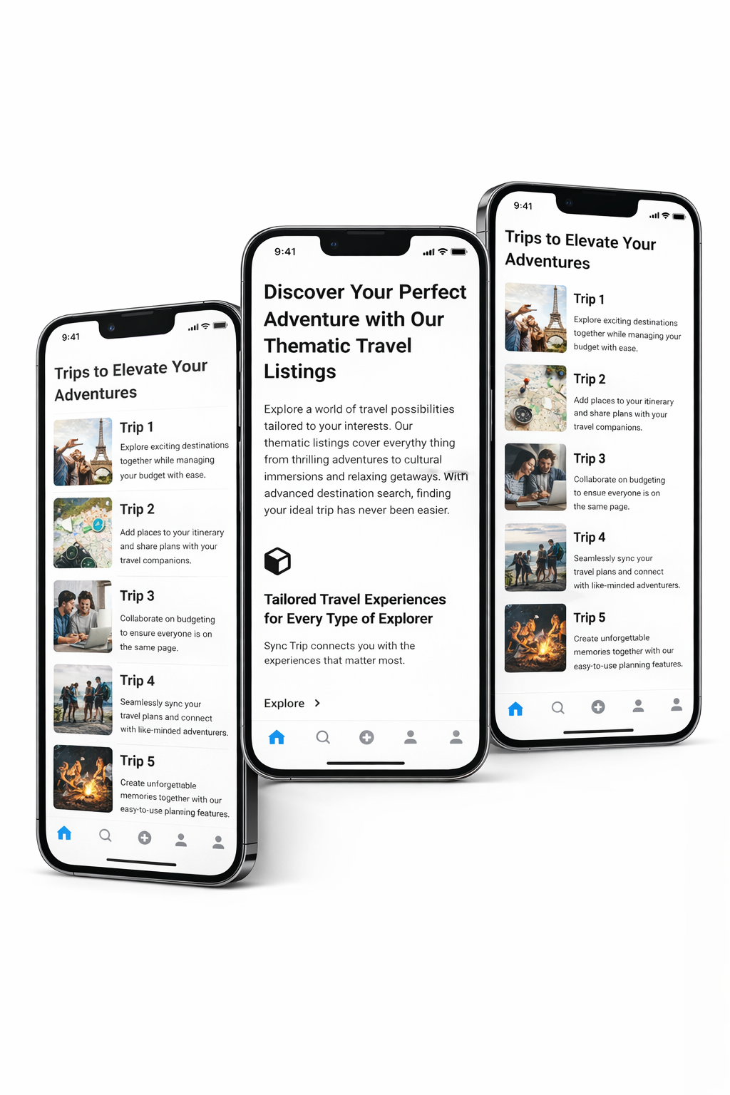
Yellow flag: Overwhelming text
While shaping the trip board, I noticed that the itinerary section quickly became a wall of text. Most travel apps present the plan as one long paragraph, and during testing this made users skim or ignore important details.
I wanted the itinerary to feel lighter and easier to navigate.
So instead of one continuous block, I split the plan into day based segments. This mirrors how travelers naturally think about their trips and reduces cognitive load. Users can tap into one day at a time without feeling rushed or overwhelmed.
I marked this change as a yellow flag for testing because I wanted to see if users would understand the new format instantly or still expect the traditional long itinerary. Early feedback showed that breaking it down by days gave users more control and made the trip feel clearer.
How this improves navigation
Breaking the itinerary into days did more than reduce text. It changed how users moved through the plan. Instead of scrolling repeatedly to find one detail, they could jump directly to the exact day they cared about.
This also made it easier for groups to discuss plans. When someone said check day three, everyone knew exactly where to go without searching through a long list.
During quick tests, users naturally tapped through the day tabs without needing cues. The structure matched their mental model, so the navigation felt simple and familiar.
Iterating based on usability test results
Red flag: Limited calendar visibility
The initial design showed only one month at a time. I assumed this was enough because most users usually plan short trips and would select dates within a single month.
However, this created a major limitation:
Users couldn’t see that trips could span two months
Longer plans felt confusing
There was no clear indication of how date ranges were being selected
Users had to manually navigate back and forth to compare dates
During usability testing, it became clear that users expected to view a broader timeline at once. The single-month view made the experience feel restrictive and caused uncertainty.
To fix this, I replaced the one-month layout with a two-month view that shows a full range at a glance. Dates now highlight immediately when selected, reducing confusion about what is included in the trip.
Priority revisions
Testing surfaced multiple opportunities to improve clarity and reduce misclicks. I evaluated each issue based on impact, frequency, and the effort required to resolve it.
Most users were able to select dates, but the experience felt unclear. Expanding the visible calendar and improving selection feedback helped users feel more confident and aware of the trip range they were choosing.
Making group travel easier with SyncTrip
DELIVER
How does SyncTrip solve real user needs?
The problem:
The problem:Planning a trip, especially with a group, has always been a messy multi-app process. People jump between WhatsApp chats, Google Sheets, Docs, screenshots, links, budgets, and endless back-and-forth messages. Information gets lost, decisions get delayed, and the confusion often leads to dropped plans or cancelled trips altogether.
The solution:
The solution: SyncTrip brings everything together into one destination for organising and planning travel. Users get all the tools and assets they need in a single place — dates, budgets, voting, itinerary planning, reminders, and tracking — without switching apps. It also works as a social platform where strangers with similar travel interests can connect, organise trips, and plan confidently as a group.
What I learned
Looking at existing research before interviews helped me enter the conversations with some direction, and revisiting it afterward made the insights sharper and the competitors clearer.
Spending time upfront on design references saved me later the wireframes came together quicker because I already knew what felt right.
And for branding, starting with what I didn’t want was surprisingly helpful. It cleared the noise and made it easier to see the direction Synctrip should take.